This is my non-official, non-commercial site about the beloved Masters of the Universe. My intention is to spread and share my enthusiasm about this fantastic toy line that accompanied my childhood.
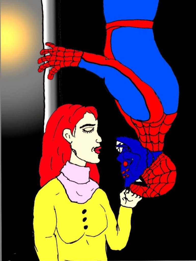
“I want spiderman, I want him to be spider under his mask, and when I call him at night I want him to say spider things and nothing else!” Love JJJJr? Me too! One of the first sketches I colored in Sketchbook (on my phone!) is the famous kiss of Peter and Mary Jane. Imagine it turned out that Webstor is the hero in disguise! His face went well, I like the red eyes on dark blue. MJ’s mouth had to make up for a bit too much distance to Webstor’s mouth, so she has a strong chin… Please not the light/ shadow from the street light. I started this sketch with pencil until I had it, then used black felt tip pen to draw the contours and colored a picture of that in sketchbook.
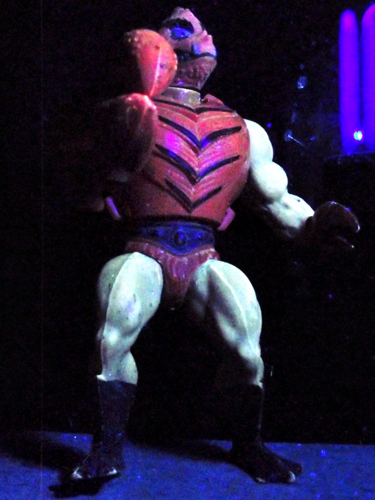
The first two reviews haven’t been too positive, sorry! Clawful is one example for a high quality character. Even after 30 years, the mechanism of the claw is working well, the shell is perfectly intact. The massive right claw is one highlight for me, able to open and close and so hold swords, wrists and other objects. The shell is indeed hard and round like a crab shell. That only appeared to me recently, I wonder if that was the intention?
His feet are duck like, with a matte, dark blue finish that wears off a little bit. They allow a very stable stand. His legs and arms have a fringe, that perfectly supports the impression of a crab. Not as worse as with King Randor, but visible, is some mold on the legs. Maybe it has to do with the shade, which is also brownish. The torso is this extreme muscular human, making him look like a human crab mutant.
The weak point of this figure is the head- by no means the quality, the material totally holds. It is more the design, and the choice of material that makes it look a bit funny. Too shallow for me, too soft, so that it invites you to squeeze it. It also has some slack when you bend it, though it does not easily come off. His face is a bit like a pitbull`s, making him look really mean, except for the double nose maybe. Much better though than many cartoon variation of him. Good for him they didn’t try to add antennas!
His weapon is kind of a club, which never sits tight on his tiny left claw.
The UV light didn’t really change his colors, but it looks great! Sorry for the low quality picture!
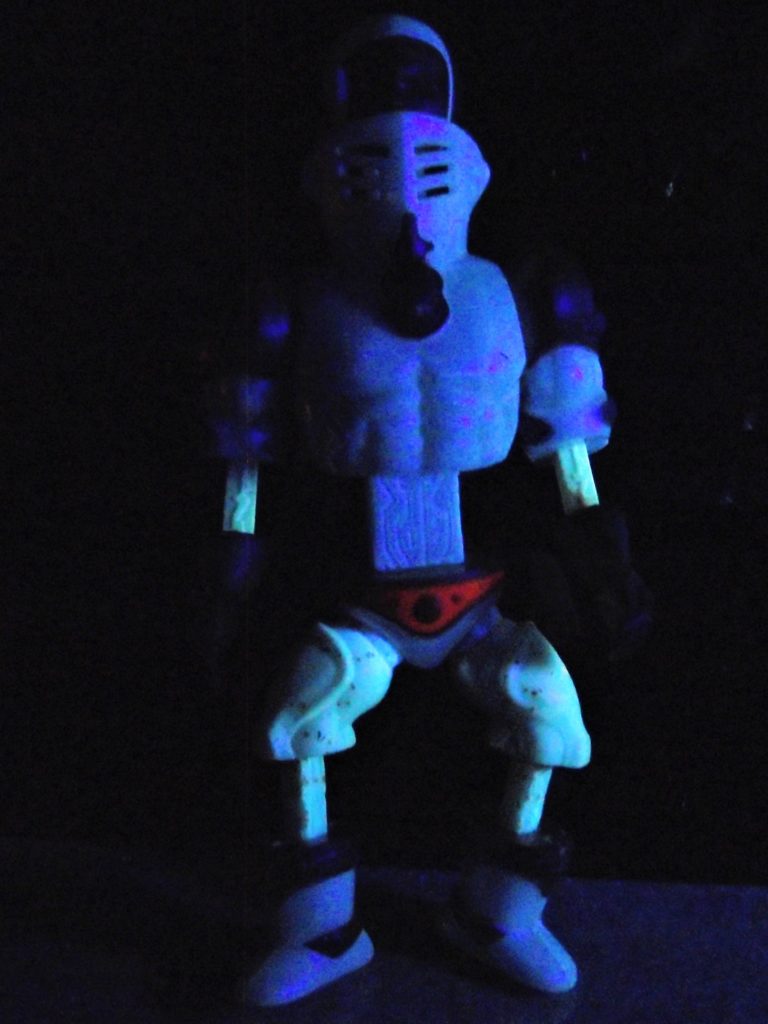
Extendar is a very special figure. To be honest I think he does not really fit into the old toyline. A white knight, half size taller than the rest, with thin extensions and large golden hands. The rubber bands of mine were a bit loose, so he never stood well and his arms used to drop. The foldable red shield didn’t close properly after a while. The golden paint wears off, and the legs are a bit moldy now, so in terms of quality my Extendar is clearly behind others. Oh and I just remember the squeaky sound it makes when you pull the arms.
I guess parents were happy about the design, which is very innocent. I can understand, that a Snakeface or Mantenna is not considered a valuable toy for kids. Extendar does not even carry a sword!
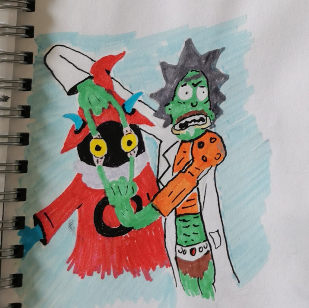
We are close to the end of my felt pen-phase! This is one of my favorites, because I love Rick and Morty! Orko is to me one one the easiest-to-draw Masters, so easy that I even forgot to give him a yellow shirt…
Rick at Arms has more of a crossover: He is wearing the lab coat, plus Man at Arm`s stuff, partly under the lab coat, partly above, for some reason. His hair is in the color of the helmet, but he got the cartoon-mustache in brown. Good thing is everything is possible for Rick, so no questions about the arms!