This is my non-official, non-commercial site about the beloved Masters of the Universe. My intention is to spread and share my enthusiasm about this fantastic toy line that accompanied my childhood.
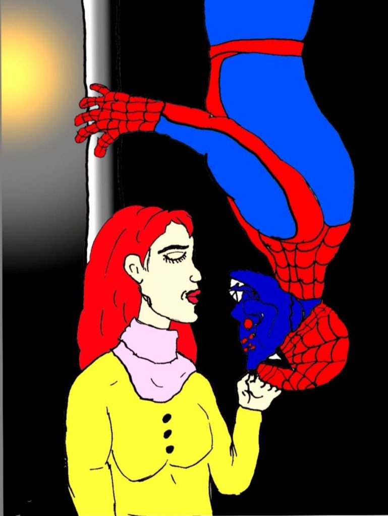
“I want spiderman, I want him to be spider under his mask, and when I call him at night I want him to say spider things and nothing else!” Love JJJJr? Me too! One of the first sketches I colored in Sketchbook (on my phone!) is the famous kiss of Peter and Mary Jane. Imagine it turned out that Webstor is the hero in disguise! His face went well, I like the red eyes on dark blue. MJ’s mouth had to make up for a bit too much distance to Webstor’s mouth, so she has a strong chin… Please not the light/ shadow from the street light. I started this sketch with pencil until I had it, then used black felt tip pen to draw the contours and colored a picture of that in sketchbook.
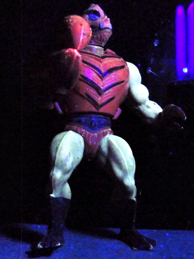
The first two reviews haven’t been too positive, sorry! Clawful is one example for a high quality character. Even after 30 years, the mechanism of the claw is working well, the shell is perfectly intact. The massive right claw is one highlight for me, able to open and close and so hold swords, wrists and other objects. The shell is indeed hard and round like a crab shell. That only appeared to me recently, I wonder if that was the intention?
His feet are duck like, with a matte, dark blue finish that wears off a little bit. They allow a very stable stand. His legs and arms have a fringe, that perfectly supports the impression of a crab. Not as worse as with King Randor, but visible, is some mold on the legs. Maybe it has to do with the shade, which is also brownish. The torso is this extreme muscular human, making him look like a human crab mutant.
The weak point of this figure is the head- by no means the quality, the material totally holds. It is more the design, and the choice of material that makes it look a bit funny. Too shallow for me, too soft, so that it invites you to squeeze it. It also has some slack when you bend it, though it does not easily come off. His face is a bit like a pitbull`s, making him look really mean, except for the double nose maybe. Much better though than many cartoon variation of him. Good for him they didn’t try to add antennas!
His weapon is kind of a club, which never sits tight on his tiny left claw.
The UV light didn’t really change his colors, but it looks great! Sorry for the low quality picture!
Extendar is a very special figure. To be honest I think he does not really fit into the old toyline. A white knight, half size taller than the rest, with thin extensions and large golden hands. The rubber bands of mine were a bit loose, so he never stood well and his arms used to drop. The foldable red shield didn’t close properly after a while. The golden paint wears off, and the legs are a bit moldy now, so in terms of quality my Extendar is clearly behind others. Oh and I just remember the squeaky sound it makes when you pull the arms.
I guess parents were happy about the design, which is very innocent. I can understand, that a Snakeface or Mantenna is not considered a valuable toy for kids. Extendar does not even carry a sword!
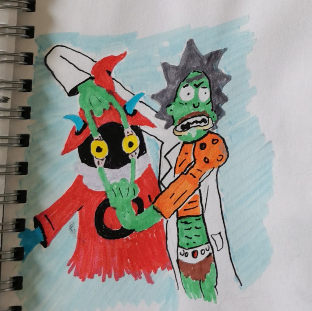
We are close to the end of my felt pen-phase! This is one of my favorites, because I love Rick and Morty! Orko is to me one one the easiest-to-draw Masters, so easy that I even forgot to give him a yellow shirt…
Rick at Arms has more of a crossover: He is wearing the lab coat, plus Man at Arm`s stuff, partly under the lab coat, partly above, for some reason. His hair is in the color of the helmet, but he got the cartoon-mustache in brown. Good thing is everything is possible for Rick, so no questions about the arms!
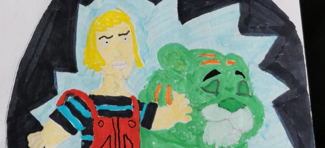
Oh man how much I struggle with faces! Yes, he got a bit cheeky on purpose, but Schmadam looks like the blonde baby king from GOT! He looks so mean, but he loves his cat, look how he is grooming his snoot! Note how Schmadam holds the edge of his bubble. I really went 3D here. The character Dennis was so different from Adam, compare both cartoons! Same for Ruff and Cringer, it is as if those roles were mixed-up, who is the one protecting Eternia, and who is the 5 years old boy? This crossover was a lot of fun and brought back some 80s memories to me. Cringer was surprisingly easy to draw, but Schmadam’s right arm is an upsi.
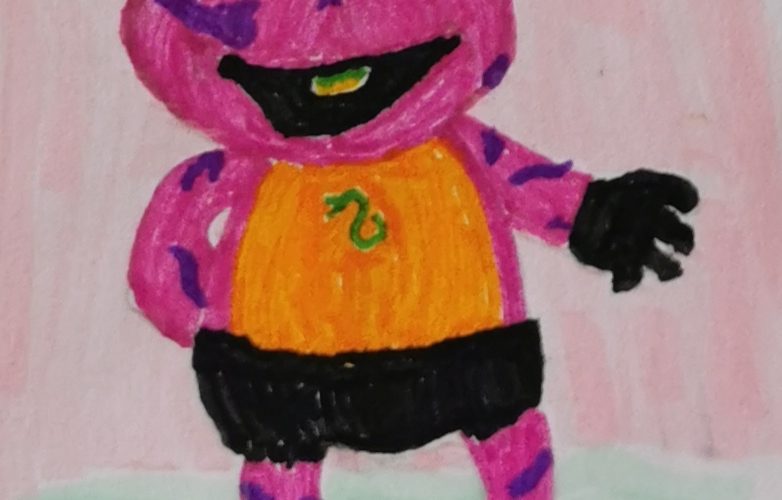
Another early piece. Tung Leashor fits well into Kermit’s shape, because he is more of a frog-man than a snakeman. The hands (!), the patterns, the long tung, all fits well, and it made me admire how Mattel nevertheless managed to give Tung Leashor an evil look. In my Table of skills Tung Leashor is a 190kg beast, here he is a baby muppet!
Kermit as baby version was rather easy to draw, he’s even got a happy face expression. Even the green snake on his chest looks cute.
I was using pastel text markers for the background. The whole sketch looks a bit rushed, because I was already thinking of the next! So many crossovers to come, wait for it!
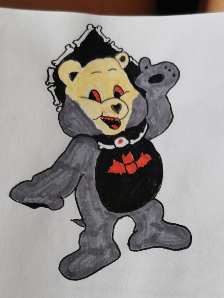
Yes, I tried any crossover that came to my mind, why not?! Gummy bears was a great cartoon with fantastic ideas. I’m sure I’ll try a crossover again. That one was the first, and somehow I forgot to add more Ram Man features while drawing. Of course Tummy the bigger bear is a good fit for our jumping hero, but hell, how could I forget the green legs? The sandals must have taken all my attention. I do like the crossover from the very shy bear and the trough-the-wall Ram Man. Imagine how he would excuse himself while smashing Snake Mountain.
Hordak is one of my favourite characters, and I’m trying to bring him on paper frequently. But for some reason he is one of the most difficult characters for crossovers.
Take this Horde bear. He is cute and I’m sure he cares, but his head is not as hordaky as I wanted it to be. I guess it is some less obvious features that make Hordak, maybe the missing nose? I just realised that I don’t even have a good idea how I imagine his head to look like.
Trapjaw as a smurf, that was quite easy. Both are blue, and a weapon-arm plus the jaw makes him recognizable already.
This was my first ever smurf and it went well, later I struggled again to draw one. It might depend on the size, this drawing is maybe 7cm, the later trail was maybe 2cm only. But wait for the Gargamel!
I don’t like him too much, it went very smurfy and lost all scariness. But every sketch teaches us something, right?
Let’s for second imagine the 80s cartoon character of Trapjaw in a smurf cartoon, that would go well, wouldn’t it? I’m sure there would be a story around indestructible nuts.
Not much ink was needed since pants and hat are white. Somehow almost any color needed to draw MOTUs are found in standard felt tip pen sets.
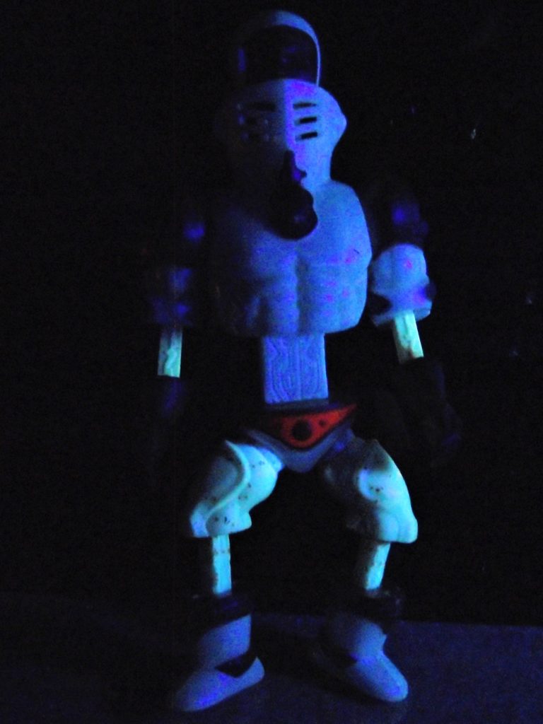
One of the most famous characters has in my opinion one of the lowest quality. But the positive first: From all figures he is the one looking the most alike a soldier, with serious face, and lots of armour (but only on one arm and leg!?). The combination of bright green and orange is a looker, though the belly is free what leaves room for some questions.
He has the full-muscle human body, and I never understood why those would not be as strong as He-Man. I also wondered about so many figures what exactly they are wearing, or whether the skin is supposed to be green? The hands are green as well.
The head is soft and invites you to squeeze it. The printed-on grey helmet wears off from all the squeezing and that leaves you then with a bold looking, naked green hero. Not sure why hardly any vintage figure had a removable helmet.
All the orange parts are made of a too hard plastic, so that after taking it off and putting it back the closing mechanisms wears off. Happened to all 3 parts, plus I lost the bat (OK that is not a quality issue) and if I remember correctly it broke too. He’s also got some mold on his legs. Other figures were of much better quality.
The green shows a nice luminescence in UV light, the orange parts unfortunately not. On the other hand the lack of orange makes him look more serious. The head looks extremely cool, thus this is one of my favourite pictures!